Image dimensions for websites are a crucial element for creators and developers. In an era where visual content dominates user engagement, balancing aesthetics and loading speed heavily depends on image optimization.
This aspect of website design significantly impacts performance and user experience, making the choice of image sizes vital for both visual appeal and the efficiency of a web page. Ensuring that images are neither too large nor too small enhances a site’s appeal and functionality.
Dive into this guide to mastering image dimensions for website efficiency. Discover best practices for optimizing website images, including the recommended image size, the best resolution, and the ideal dimensions for website banners and more.
Understanding Image Dimensions for Websites
First, we need to understand that image dimensions for websites are essential, as dimensions measured in pixels dictate an image’s width and height, influencing how it appears across different devices like computers, smartphones, or tablets.
These measurements are critical because various sections of a website, such as backgrounds or galleries, require different scales. The right image dimensions ensure visuals are appropriately sized to avoid slowing down the page load or adversely affecting image quality.
Pixel Dimensions vs File Size

Pixel dimensions and file size, while often confused, are distinct yet interdependent metrics crucial for optimizing website performance. The first concept refers to the total number of pixels in an image. Meanwhile, file size indicates the amount of data required to store that image.
Smaller file sizes lead to faster loading times, enhancing user experience and improving SEO. On the other hand, incorrect file sizes can result in slow loading times and higher bounce rates. Therefore, understanding and balancing both pixel dimensions and file size is essential for creating efficient, visually appealing websites.
Once we´ve clarified these concepts, we´re ready to discover the best practices for optimizing website images.
Best Practices for Optimizing Website Images
Optimizing website images is essential for improving page load times, enhancing user experience, and boosting overall website performance. Let’s explore the best practices for optimizing website images, including selecting the proper dimensions, using effective compression techniques, and choosing the most suitable image formats.
Choosing the Right Dimensions
Selecting the appropriate image dimensions ensures images display correctly on various devices without unnecessarily increasing page load times. For instance, a pixel width of 2500 pixels is ideal for background images, covering most screen sizes without causing blurriness.
However, the optimal size varies depending on the use case. For instance, images for blog posts may not need to be as large. Google recommends to keep the largest image file size under 100 Kb to avoid negatively impacting page load times. For mobile devices, it’s important to consider specifying alternate images to improve loading times and data usage.
Image Formats and Their Uses

As I mentioned earlier, choosing the right image format is critical for optimizing website images. Let’s quickly review the main image formats that exist and their recommended uses.
- JPEG is recommended for photographs due to its balance between file size and quality.
- PNG is ideal for images requiring transparency, like logos or icons, although it generally results in larger file sizes.
- SVG, a vector image format, is perfect for images that need to scale across different resolutions, such as icons or logos, providing sharpness and clarity at any size. However, it’s important to note that SVG files can be corrupted if not handled properly, which can affect their display and functionality.
- WebP, a newer format introduced by Google, offers superior compression for both lossy and lossless images, making it an excellent choice for various types of web images. Nevertheless, not all browsers are compatible with this format, which can limit its usability in some cases.
When selecting image formats, consider the specific needs of each image and the overall impact on website performance.
Compression Techniques
Compression techniques play a pivotal role in reducing file sizes while maintaining image quality. There are two main types of compression: lossless and lossy.
- Lossless compression reduces file size without losing quality, suitable for images where detail is paramount.
- Lossy compression, which can significantly reduce file sizes by sacrificing some image quality, is acceptable for photographs.
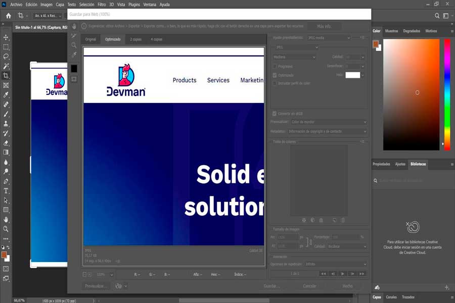
Tools like TinyPNG or Adobe Photoshop’s “Save for Web” feature help achieve an optimal compression of both types.
Balancing file size and image quality is crucial for enhancing website performance, as is choosing the right image format based on the image’s specific needs and overall impact on website performance, let’s take a look at it now.
By adhering to these best practices, website owners and developers can ensure that their images are optimized for speed, appearance, and functionality, contributing to a better user experience and improved website performance.
Common Image Types and Their Ideal Sizes
Choosing the correct image format and size for every type of image that appears in a website is essential for optimizing the web’s performance and visual appeal. High-quality images can significantly enhance user experience, but they must be properly sized to avoid slowing down the site.
Background Images
For websites aiming to make a strong visual statement, background images play a critical role. These images envelop the entire landscape of a webpage, setting the site’s tone.
According to Google’s recommendations, the optimal dimensions for background images on desktops are 1920 x 1080 pixels, adhering to a 16:9 aspect ratio. This size ensures coverage across most screen sizes without sacrificing image quality. For a more immersive experience, dimensions can extend up to 2400 x 1600 pixels, with file sizes kept under 1MB to maintain optimal loading times and enhance user experience
Hero Images

Hero images are another focal point of a website’s homepage or landing pages, often capturing visitors’ attention upon arrival. These images are typically large, with recommended dimensions of 1280 x 720 pixels for a 16:9 aspect ratio, ensuring they display well across various devices.
Depending on the website design, hero images can extend up to 1800 px in width. It’s crucial to balance the hero image’s visual impact with its loading speed to maintain user engagement and web core vitals correctly.
Banner & Ad Images
Banner and ad images are crucial elements in digital marketing strategies, designed to capture users’ attention and drive clicks. For optimal performance, Google recommends using various sizes. According to Google Ads Support for web banners, a common and effective size is 250 x 250 pixels with a 1:1 aspect ratio, which fits well in multiple placements across a website.
When it comes to ad images, leveraging Google’s recommended sizes, such as 728 x 90 pixels for leaderboards and 300 x 250 pixels for medium rectangles, enhances visibility and engagement. It’s important to keep file sizes around 150KB to ensure quick loading times, improving user experience and ad effectiveness
Blog & Thumbnail Images
Images used in blog posts enhance the content’s appeal and can significantly impact user engagement and social sharing. The ideal size for blog images is 1200 x 630 pixels with a 3:2 aspect ratio, providing a balance between visibility and page loading speed.
Thumbnail images, essential for previews and social media links, should ideally measure 1200 x 630 pixels. This uniformity in size and aspect ratio across blog and thumbnail images ensures consistency and optimizes the visual experience for viewers.
Let’s explore various tools for managing website images effectively, ensuring that your site remains visually stunning while maintaining optimal loading speeds.
Best Tools for Managing Website Images

Effective management and optimization of website images are crucial for site performance and user experience.
Adobe Photoshop leads in comprehensive editing capabilities, while alternatives like Capture One Pro and Affinity Photo offer efficient batch editing and professional features. Compression tools like Compress Now, and JPEG Optimizer reduce file sizes without sacrificing quality, essential for improving website load times.
For OpenCart users, plugins like Tinify (TinyPNG) Integration, which uses the TinyPNG API to compress images significantly without compromising visual quality, and Image Optimizer, which allows administrators to set image quality levels for optimization, are highly effective.
NitroPack, an all-in-one performance enhancement service, includes image optimization, advanced caching, a built-in CDN, and minification of HTML, CSS, and JavaScript, operating seamlessly in the background and requiring no coding skills to set up.
By integrating these tools and strategies, website owners can significantly improve their site’s visual content, optimizing images for both aesthetics and performance.
Final Thoughts
Optimizing images for websites not only enhances their aesthetic appeal but also boosts functional performance by balancing speed with visual quality.
By selecting the right dimensions, employing efficient compression techniques, and choosing appropriate formats, developers and content creators can significantly elevate user experience, fostering deeper engagement and sustained interest.
Utilizing these best practices, along with top-notch tools, ensures that each visual element is both impactful and efficient, contributing to a more vibrant and accessible internet for everyone.